12.17.2013

room by room :: guest/kids bathroom

While I'm putting the finishing touches on the boys' bedroom, I thought I'd share the design plan for the downstairs guest bath that is primarily used by the kiddos. Keeping that in mind, I wanted the bathroom to be #1 functional and easy to clean, #2 simple and classic and #3 gender neutral. One of our first choices was this vanity and sink combo from Ikea.
Hemnes + Rattviken Sink Cabinet $379 :: Ikea
We spotted these vanities on a "idea gathering" trip early in construction and, individually, picked them out. Then when we were showing each other what we liked...we realized we'd chosen the same ones making these an easy choice. I was inspired by the color scheme and stripe design in this bathroom by Sarah Richardson (one of my favorite designers).
Classic Ensuite :: Sarah 101
In this design, she blended off-the-shelf tiles in white, cream and gray - a combo that I felt was neutral but not too boring and would give me flexibility with wall paint and accessories through the years. Now, to interpret that inspiration for our bath. First I chose the floor tile and grout color (which I also planned to use in the master bath).
American Olean 12-in x 12-in Sausalito White White Ceramic Mosaic Wall Tile (Actuals 12-in x 12-in)
American Olean 12X12 White on White Hexagonal Tile $2.57/sf:: Lowe's
Polyblend Sanded Grout in Delorean Gray :: Home Depot
The photo of this grout is quite a bit darker than the actual product when it's dry. I thought the gray was a nice contrast to all of the classic white tile. I had already I painted the walls a very pretty light gray. 
We installed a white tub, deciding on ceramic tile for the shower surround. For this, I wanted a rectangular field (main) tile, but large rectangle tiles are muy expensive! So I searched and searched, configured and reconfigured...I finally settled on this 6X8 tile from Home Depot. In the end, the size turned out just right and the price was awesome!
U.S. Ceramics 6X8 Tile in Bright Snow $2.25 ft :: Home Depot
But of course, I wouldn't be happy with a plain white shower stall. So I broke out my trusty graph paper and designed a stripe pattern that would add some style, but hopefully not be too busy for the space. I found a gray 2X6 trim tile and penny rounds in an almond color.
Daltile Semi Gloss 6X2 Bullnose Ceramice Tile in Ice Gray $0.98/each :: Home Depot

Merola Tile Cosmo Penny Round in Almond (12X12 sheets) $6.97/each :: Home Depot
I decided on two accent stripes that consisted of a 4" band of the almond penny rounds sandwiched between two bands of the gray bullnose. I ordered the accent tiles without getting samples first, but when they arrived, I couldn't have been happier. The gray is almost a perfect match to the wall color and the penny rounds have several shades of cream and almond that give it really nice dimension.

**A little side note of serendipity here: When I was shopping for the gray ceramic tile, I took a chance and ordered the bullnose tiles which were less than a dollar each as opposed to $2.05 for the 1/2X6" flat liner (too thin anyway) or $1.98 for the 2X6" field tile. That was a huge savings! As it turns out, the thickness of the ceramic field & accent tiles is slightly more than the thickness of the penny rounds. So when installed, the curve of the bullnose rounded perfectly to the penny rounds. I'd like to say I planned that all out, but I just got super lucky!

I'm framing the last art prints now and installing a few accents. I'll post shots of the completed room soon!

BTdubbs...Only a week till Christmas Eve!! Heading out now for some last minute shopping, which is honestly, my favorite kind. I love working on a tight deadline! LOL 

Merry Christmas Peeps!


SHARE:

12.13.2013

working with :: radiant orchid

Last week, Pantone announced "Radiant Orchid" as the 2014 Color of the Year. The company, who is the world-wide authority on color, describes this year's selection as "an enchanting harmony of fuchsia, purple and pink undertones" that "inspires confident and emanates great joy, love and health."
This is a strong color and translates easily in the fashion and beauty industries. We're all comfortable seeing pink and purple tones in cocktail dresses and eye shadows...but how do you utilize this shade in your home? Just like any other color, I like to take inspiration from nature. Here are three directions to take:

:: from the sea ::
sea urchins
image courtesy of Steve Jurvetson
The orchid color is found in these sea urchin shells and is complemented with lighter pink, sandy tones and shades of white. Here are some Benjamin Moore colors that would be beautiful and I envision a lovely, restful sitting room with a moderately feminine feel:
Pink Raspberry is a slightly lighter shade and an excellent jumping off point. I'd pepper it throughout the room in the artwork, trims and accents.
Newborn Pink would be beautiful in luxurious silk pillows or maybe on a pair of slipper chairs.
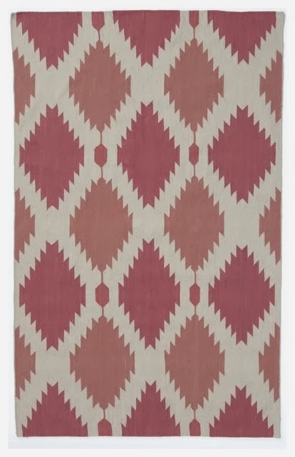
Used on the walls, April Pink is a pale shade that has brown undertones and would read as a neutral. Underfoot, I found a great pink ikat rug that blends the pink and orchid tones and introduces a modern pattern to the space.
Phoenix Wool Dhurrie 8X10 $384 (on sale!!) :: West Elm 
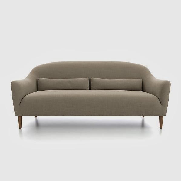
I loved the curvy, inviting shape of this sofa from Crate & Barrel and the linen color is the perfect for moderating all of the other pink tones.
Pennie Sofa in Linen color $899 :: Crate & Barrel
:: from the garden ::
orchids
image courtesy of ImagesBackgrounds
Acid green is the perfect counterpoint to this rich hue and balanced with heavy doses of white, I'm inspired to create a clean, modern dining room.
Go all in and saturate the walls with Pre-dawn Sky. I might even take it a little further and have it applied in a high-gloss lacquer like finish. Definitely dramatic, but why not??


The clear, bright tone of Hibiscus hits the mark as a great contrast to the orchid. This parsons dining table is a classic design that will forever be on my list of favorite furniture. The sleek white lacquered finish works well to give the eye a rest and helps make your table setting the star.
White Lacquered Parsons Dining Table $399 :: West Elm
Speaking of table settings, I think this green china from Martha Stewart for Wedgewood is a great accent and adds a little traditional design to this otherwise modern space.
Martha Stewart Moss Garland :: Martha Stewart Weddings
:: from the sky ::
stunning sunset
image courtesy of FineArt America
Breathtaking sunset like these with their saturated color combinations are often a source of inspiration. I'm taking this color story into the bedroom and using the orchid as an accent instead of the main event.
I love a restful color in a bedroom and Patriotic White provides a hint of blue that is calm and airy.
We all know how nicely rich browns, like Clinton Brown, and light blues work together, but you may not think to combine brown and fuchsia. However, the trio is really beautiful when used in the right proportions. I would use this deep brown in velvet on a settee, on the bedding and in a pattern on the drapes.
Crushed Berries is another excellent option when interpreting the "radiant orchid" trend. I would use it in fabric accents and maybe lacquer a side table to really bring out the richness. I'd love to see how you're planning to include this shade in your home...


SHARE:
© Lemongrass Interiors | All rights reserved.
Blogger Template made by pipdig