
:: from the sea ::
 |
| sea urchins image courtesy of Steve Jurvetson |
Pink Raspberry is a slightly lighter shade and an excellent jumping off point. I'd pepper it throughout the room in the artwork, trims and accents.
Newborn Pink would be beautiful in luxurious silk pillows or maybe on a pair of slipper chairs.
Used on the walls, April Pink is a pale shade that has brown undertones and would read as a neutral. Underfoot, I found a great pink ikat rug that blends the pink and orchid tones and introduces a modern pattern to the space.
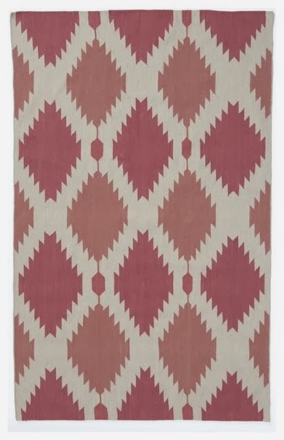 |
| Phoenix Wool Dhurrie 8X10 $384 (on sale!!) :: West Elm |
 |
| Pennie Sofa in Linen color $899 :: Crate & Barrel |
:: from the garden ::
 |
| orchids image courtesy of ImagesBackgrounds |
Go all in and saturate the walls with Pre-dawn Sky. I might even take it a little further and have it applied in a high-gloss lacquer like finish. Definitely dramatic, but why not??
The clear, bright tone of Hibiscus hits the mark as a great contrast to the orchid. This parsons dining table is a classic design that will forever be on my list of favorite furniture. The sleek white lacquered finish works well to give the eye a rest and helps make your table setting the star.
Speaking of table settings, I think this green china from Martha Stewart for Wedgewood is a great accent and adds a little traditional design to this otherwise modern space.
 |
| White Lacquered Parsons Dining Table $399 :: West Elm |
 |
| Martha Stewart Moss Garland :: Martha Stewart Weddings |
:: from the sky ::
 |
| stunning sunset image courtesy of FineArt America |
I love a restful color in a bedroom and Patriotic White provides a hint of blue that is calm and airy.
Crushed Berries is another excellent option when interpreting the "radiant orchid" trend. I would use it in fabric accents and maybe lacquer a side table to really bring out the richness. I'd love to see how you're planning to include this shade in your home...
No comments:
Post a Comment